Rethinking Content Creation at Locatify

Project Overview
Aligning the system with the creator's mind
We redesigned the Locatify CMS to support story-driven workflows, making it easier for non-technical creators to build location-based experiences.
The goal was to reduce complexity, improve structure, and align the system with how creators actually think.
"When structure aligns with user thinking, the interface disappears and creation becomes the focus."
The Challenge
The CMS had evolved into a powerful but cluttered system. Creators struggled with:
- unclear navigation
- fragmented workflows
- too many steps for core tasks
- difficulty understanding structure
Support requests increased, and onboarding slowed down. The system worked technically, but not mentally. My role covered UX strategy, research, prototyping, and UI design over a 24-month redesign effort.
Insight & Approach
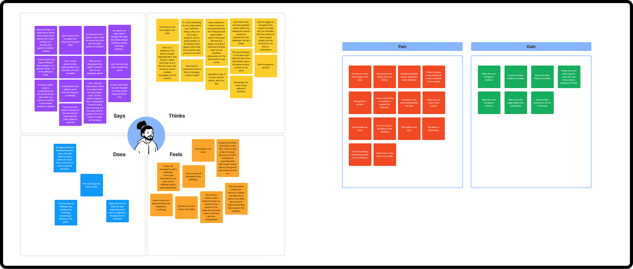
The mental model mismatch
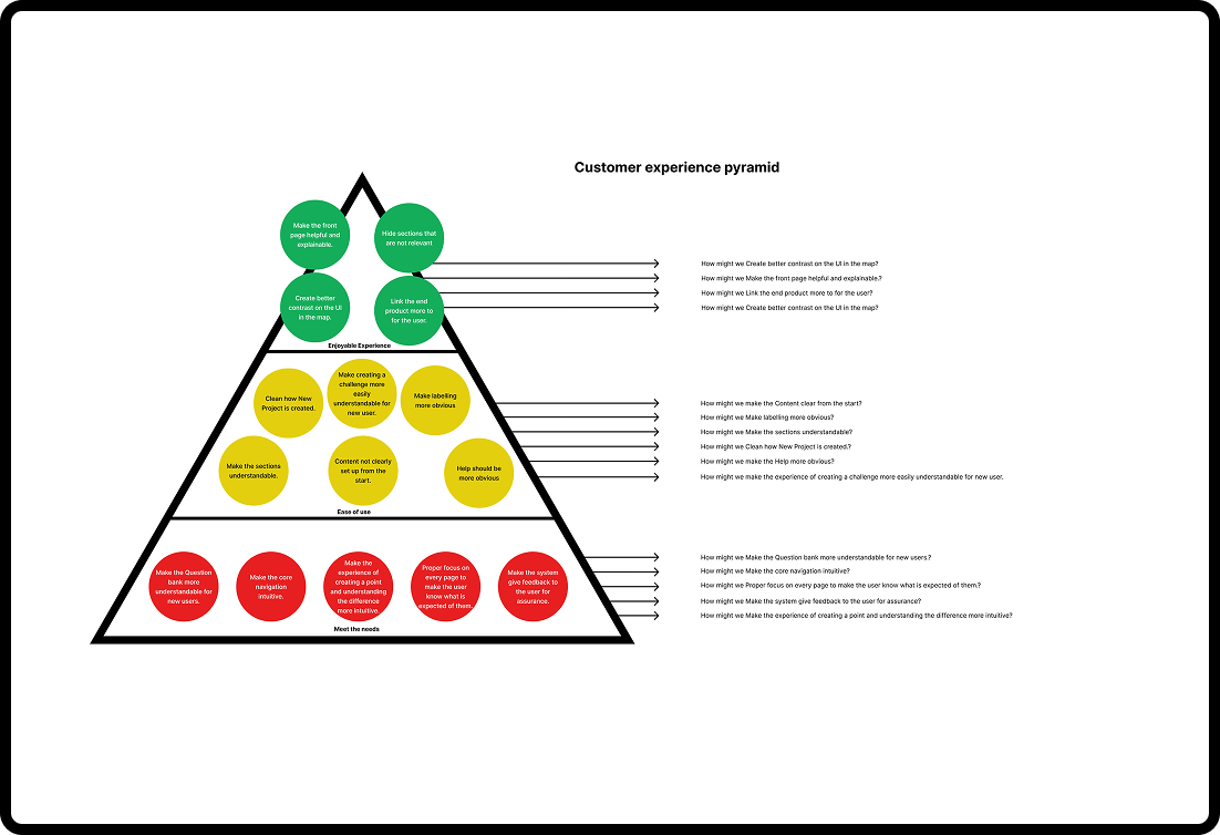
Research showed a clear pattern: The issue wasn’t features. It was mental model mismatch. The system was structured around technical logic. But creators think in stories, locations, and experiences. That gap created friction in every part of the product.
The Approach
We redesigned the CMS around three principles:
- Clarity: Reduce cognitive load and make structure visible.
- Flow: Keep users in context and reduce unnecessary navigation.
- Control: Support flexibility without overwhelming complexity.
Key Changes
We shifted the system from technical structure to creative workflow.
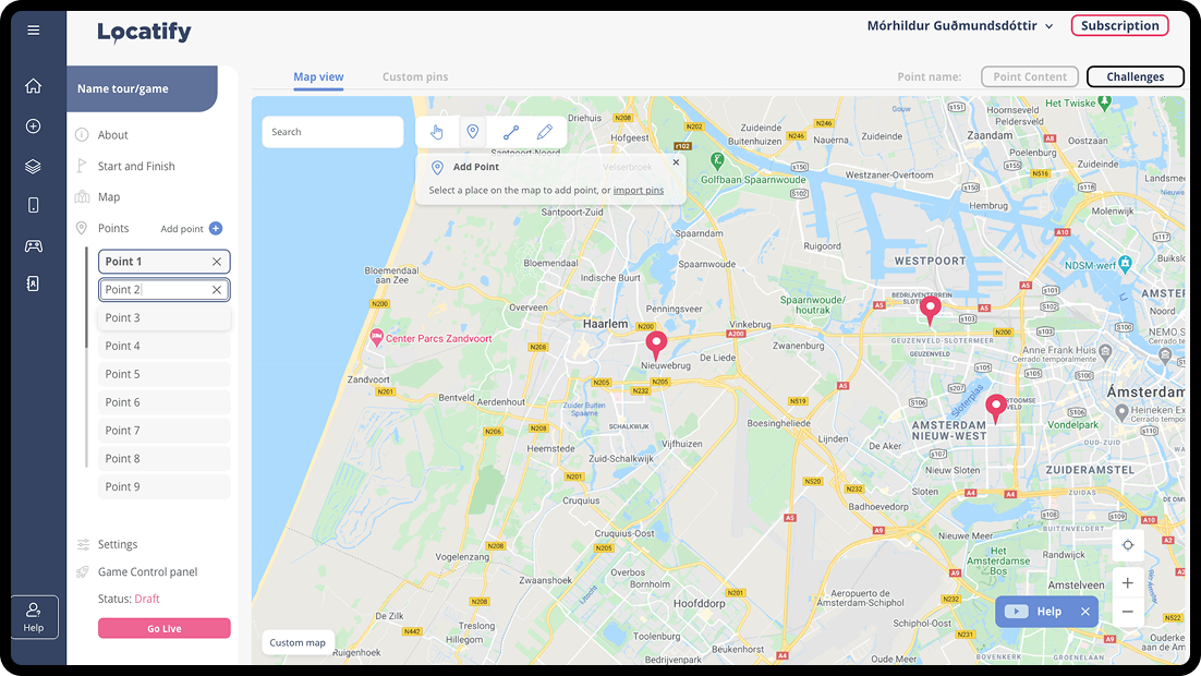
Information architecture
We restructured navigation around how creators build experiences, not how data is stored.
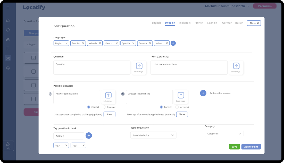
Modular editor
The tour editor became a card-based system where each location is self-contained. This removed the need for users to mentally assemble content across screens.
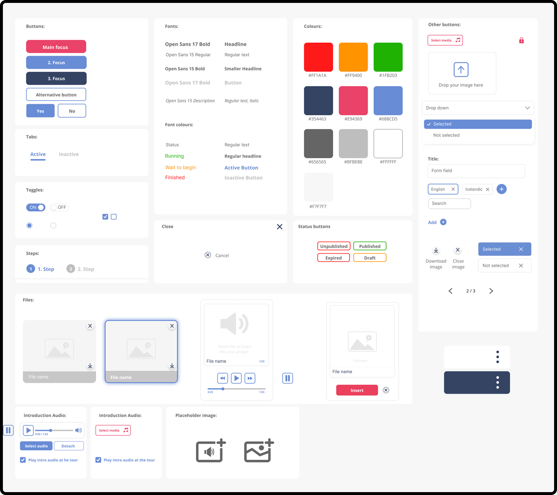
System foundation
We introduced reusable UI patterns that formed the basis for a scalable design system.
Outcome
The redesigned CMS improved both usability and system scalability. Results included:
- fewer support requests related to navigation
- faster onboarding for new users
- improved retention among independent creators
- a more consistent product foundation for future development
Most importantly, creators could focus on building experiences instead of understanding the system.
Reflection
This project reinforced a simple idea: Complexity rarely comes from features. It comes from unclear structure.
When structure aligns with user thinking, the interface disappears and creation becomes the focus. That’s the kind of problem I enjoy working on.