Investing in Fine Wine, Made Clear
Project Overview
Turning data into confidence
We redesigned the Vindome experience to turn complex wine market data into intuitive investment insights. Our goal was to make fine wine accessible for beginners while keeping the deep tools experts need.
The result was a more approachable and trustworthy experience where finance meets passion.
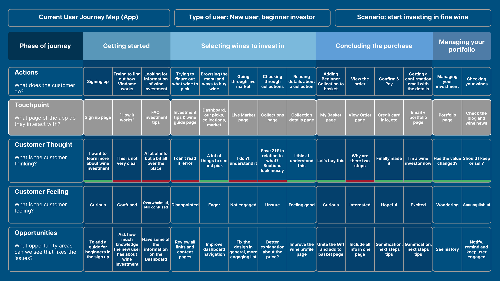
The Challenge
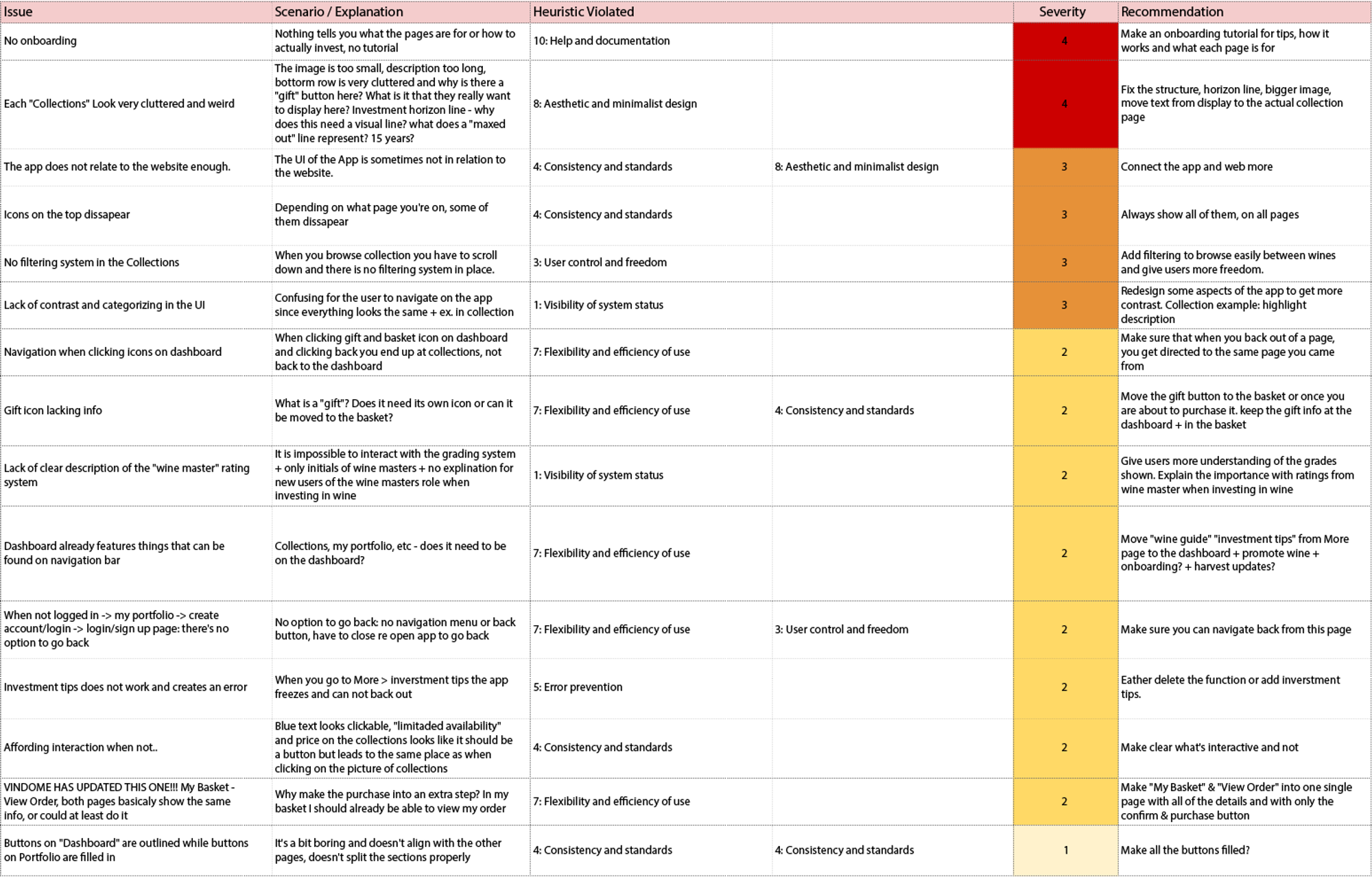
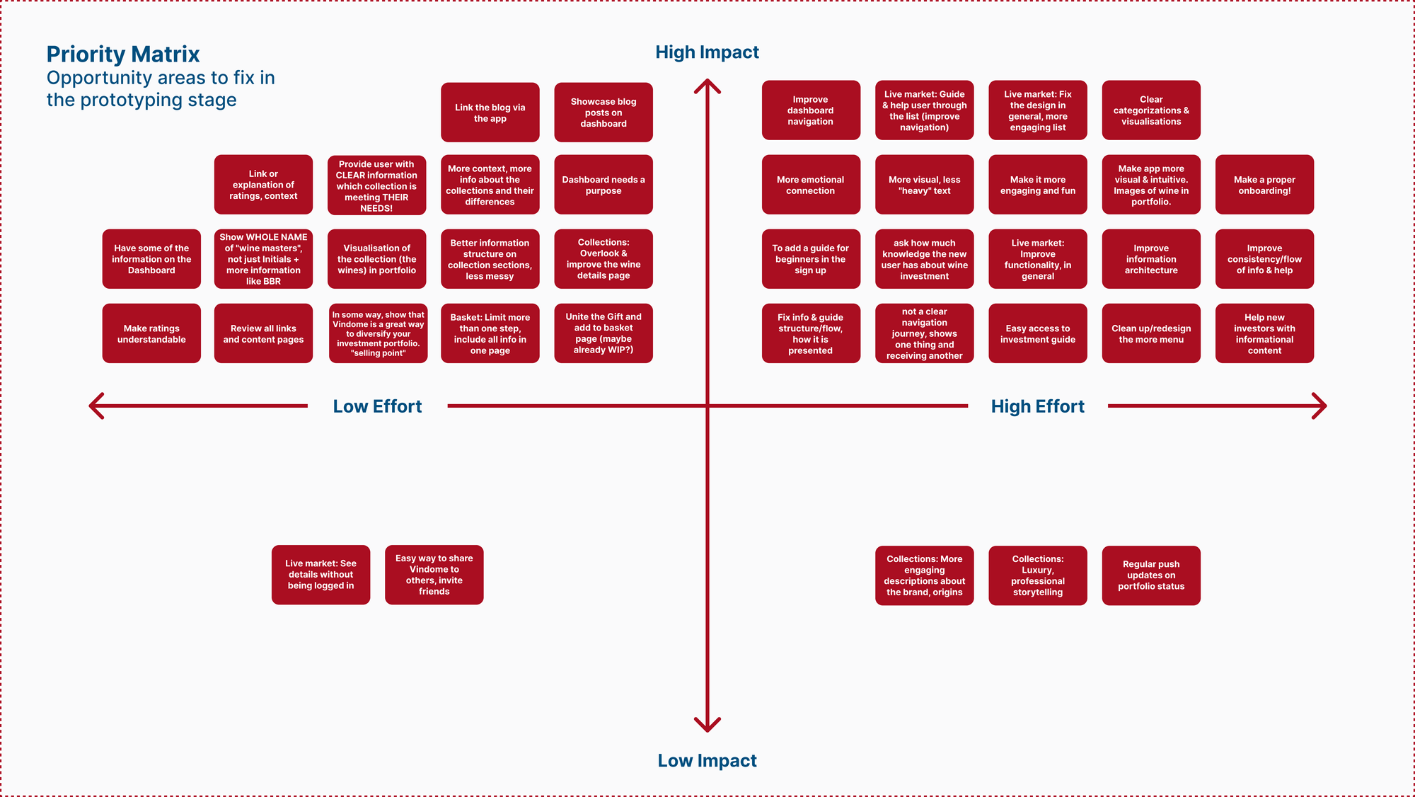
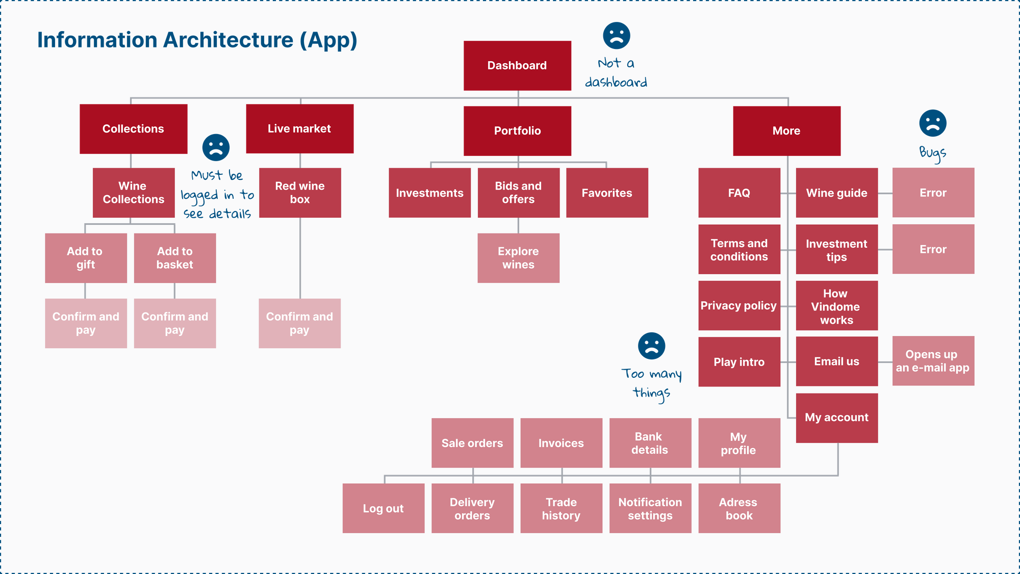
Fine wine investment is a niche world with high stakes. The app had usability barriers that made it hard for new users to feel confident. Navigation was fragmented, onboarding felt clinical, and critical data was hard to trust without deep expertise. The system worked for pros, but it didn't guide the rest of us. Creators struggled with:
- confusing onboarding
- fragmented navigation
- disconnected investment insights
- sterile portfolio experience
Insight & Approach
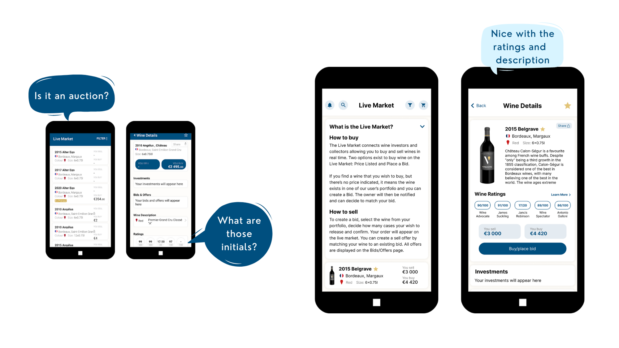
The confidence gap
Research showed that users weren't just looking for data: they were looking for confidence. They wanted to feel the passion of wine while making smart financial decisions. The digital experience was too sterile for such a physical, passionate investment.
The Approach
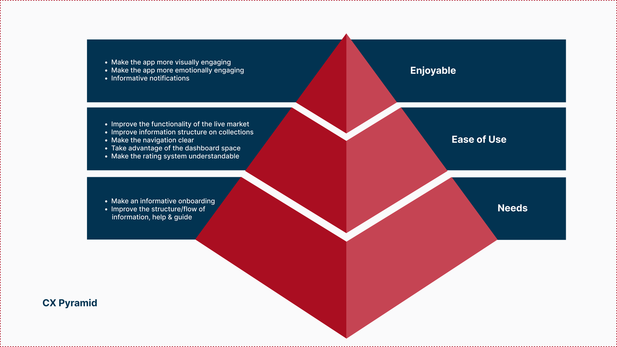
We reimagined the platform around three principles:
- Accessibility: Remove technical jargon and guide beginners.
- Trust: Make data visualization clear and actionable.
- Passion: Align the digital tools with the physical joy of wine collecting.
Key Changes
We bridged the gap between complex data and human intuition.
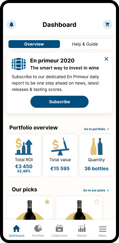
Guided onboarding
Introduced expertise levels so users aren't overwhelmed by data they don't need yet.
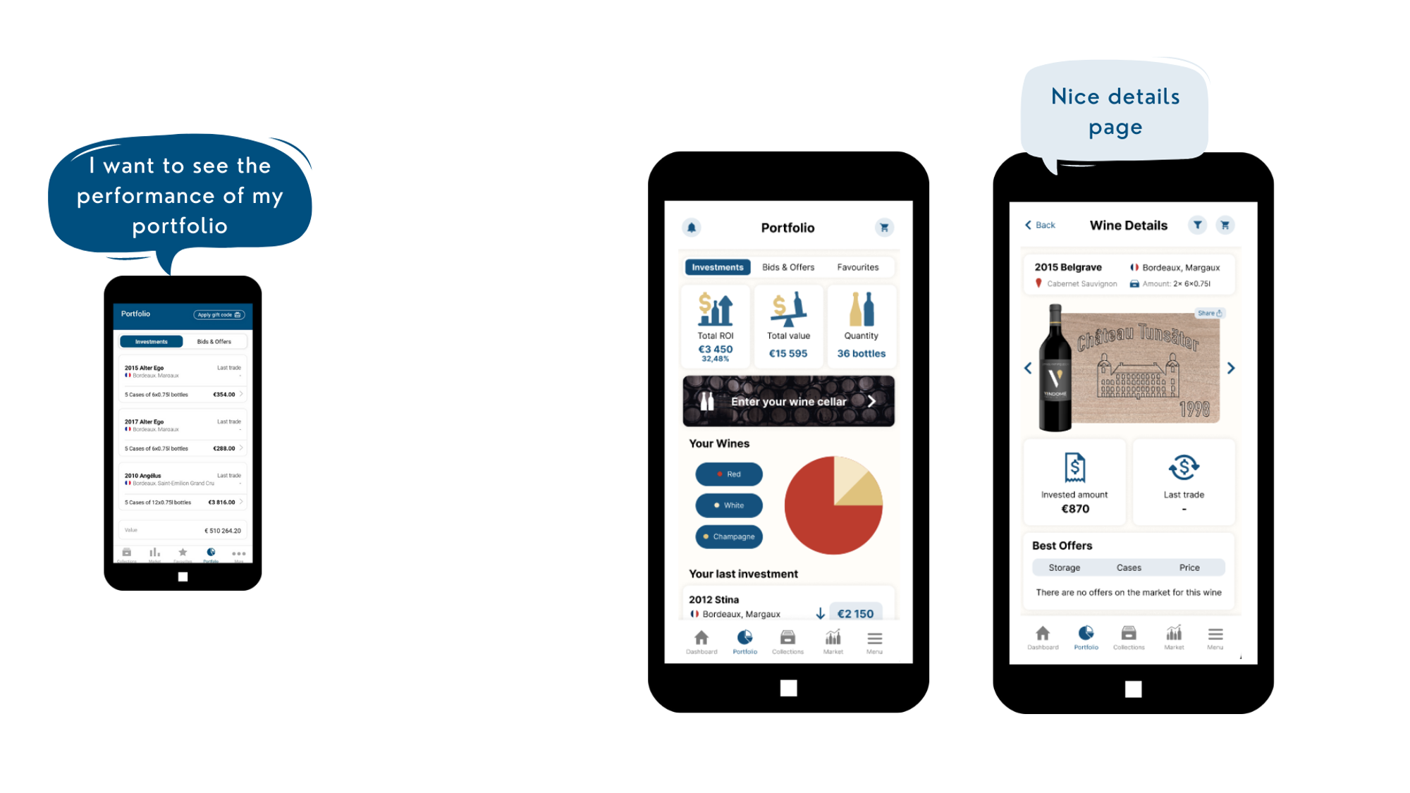
Virtual cellar
Reimagined the portfolio to feel like a real wine collection, not just a spreadsheet.
Market insights
Added human-readable explanations to complex market movements.
Outcome
The result was a more approachable and trustworthy experience. Results included:
- smoother onboarding and higher user confidence
- reduced navigation friction
- a more intuitive portfolio that matches investor mental models
Vindome became a tool that guides users, rather than just showing them data.
Reflection
Finance doesn't have to be cold. When you combine complex data with a human perspective, you build something people can actually use. That's where real impact happens.